Design Exercise with JagaRico or じゃがりこ
Hello, readers. It’s been a while. My name is Tiffany, and I’m currently a UX Research and Design Lead at CureApp. In my free time, I enjoy doing more UX Research, Design, and Localization.
Recently, I bought my all-time favorite snack, JagaRico(じゃがりこ), from Costco. I’ve loved it since I was a child, and I’m happy to see they’ve “localized” their snack to sell to non-Japanese consumers.
Well... I’m not entirely sure if they “localized” it or even tried to “localize” it. The current JagaRico packaging still feels “Japanese” and not very “localized.” It is pop and friendly, though. JagaRico and its parent company Calbee are known for their popular snacks and fun branding. They may have kept their branding and just “localized” some wording.
Design Exercise
I thought it would be a fun little exercise to see what the packaging would look like if they used a more “American” font. Using three different fonts—Inter, Poppins, and DM Serif—I wanted to see how the vibes would change on both the front and back of the packaging.
Front of the packaging
Assuming the font used for “Original” is Mochi Pop One, it gives me “Japanese” vibes due to its width and the accents on the letters.
Let’s see how it looks with different fonts.
Inter gives a different “Japanese” vibe, feeling stricter and more Type A. Companies that are the opposite of Calbee (fun and friendly) might use this font as their default.
Poppins gives a very similar feeling to Mochi Pop One but feels more “American.” Does this make sense to you all, or is it just me because I’m both Japanese and American?
DM Serif is off-brand but would work well if the whole packaging needed a luxurious feel.
While working on this, I felt weird reading “Original.” It made me think, “What is ‘Original’ anyways?” In Japan, this flavor is called “Salad” flavor. I can see why they chose “Original” as “Salad” might seem weirder. But if you’ve never had JagaRico, you wouldn’t even know what “Original” is. So the bottom example is me “localizing” it from “Original” to “Veggies.” It feels right to me; what do you think?
Back of the packaging
Moving on to the back of the packaging.
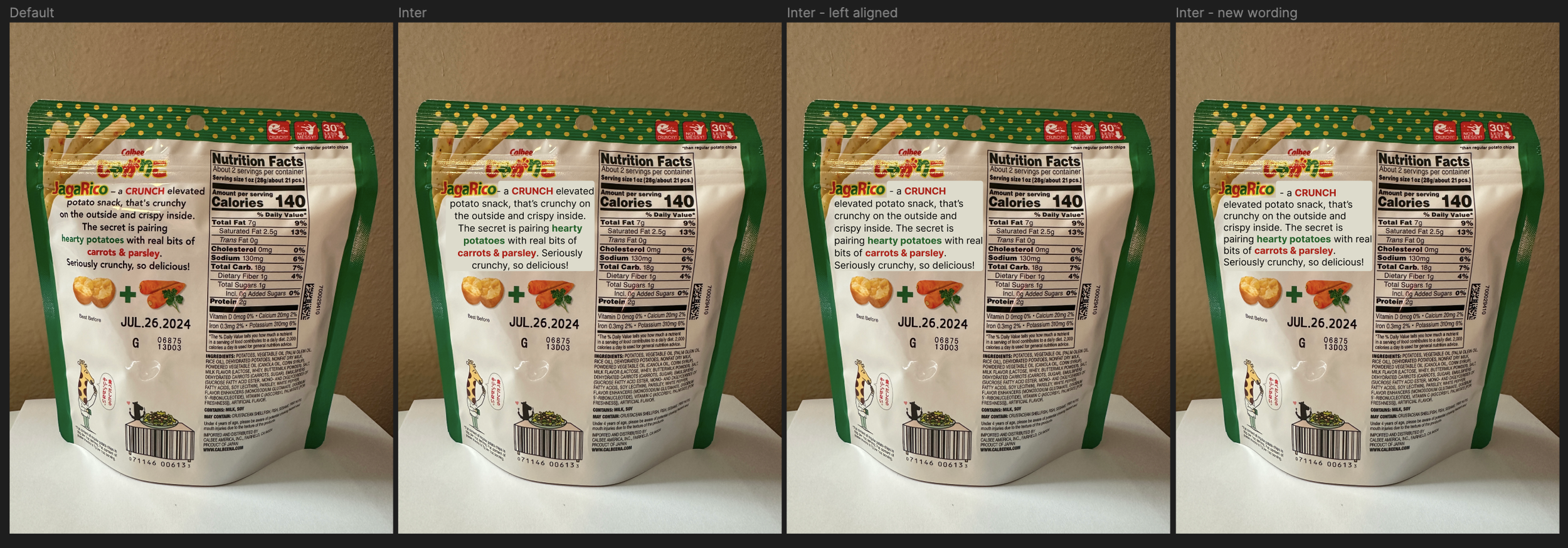
There’s a little description in the top left corner that just shouts “Japanese” to me. I’m not entirely sure why—maybe the center alignment, the font, or the wording. I decided to use the same three fonts and test out text alignment and wording as well.
Inter
Poppins
DM Serif
Honestly, Poppins works the best in my opinion. I prefer left alignment as center alignment is outdated and difficult to read. Poppins makes it feel a bit more “American” than Inter. DM Serif could be used if, again, the packaging is elevated to a luxurious one.
Conclusion
To conclude this small experiment: fonts, designs, and wording are very important when “localizing.” For JagaRico, they may have chosen to keep that “Japanese” feeling—and that’s totally okay! The point of this blog was to show that these “small” details can make consumers feel connected to the culture, see legitimacy, and find it trendy, etc.
Please feel free to reach out if you have a better explanation than I do. I just had to do this little exercise before I could focus on other things.


